AEB
Equipped for the future
We’re developing a new visual brand identity
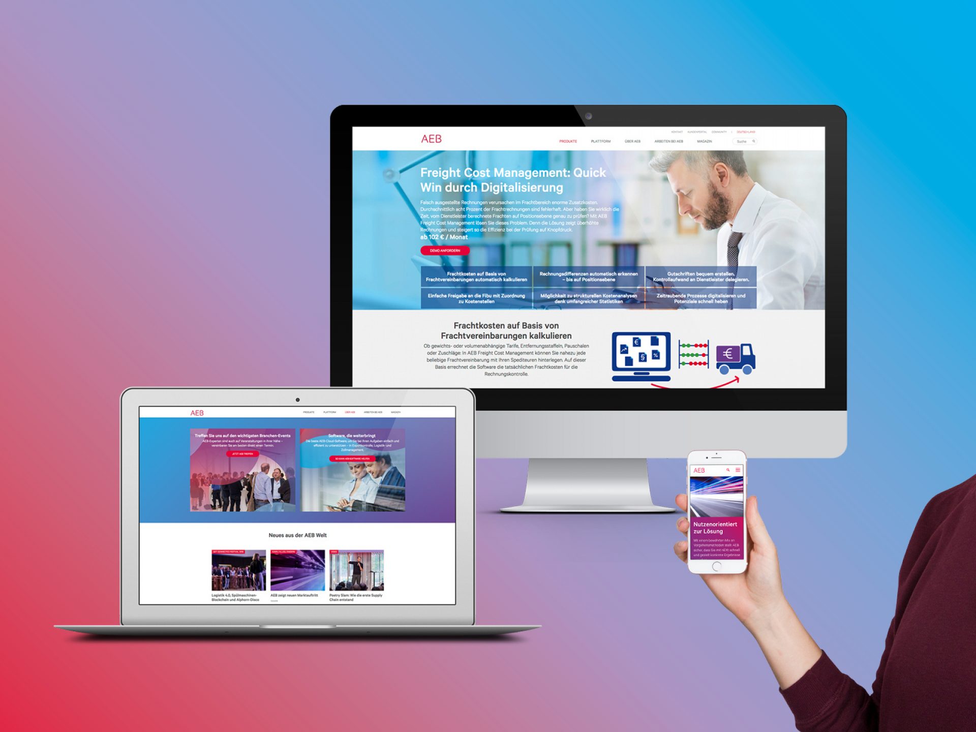
AEB is equipping itself for the future by repositioning its company and brand. In a visual sense, the company has undergone a complete transformation: LIGALUX created a new corporate design that marks a departure from industry-typical branding.
AEB is one of the leading suppliers of IT solutions for logistics and international trade. Over 5000 companies worldwide use the software produced by the SME. In addition to the brand repositioning, we were tasked with developing a visual identity that would align with the innovative and future-oriented approach of the company without impacting its pragmatism and support.
The new brand identity is just as agile as the company itself.
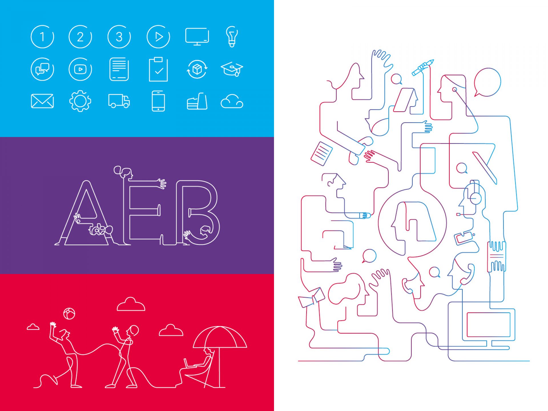
The classic AEB red will remain, as it is recognised by customers and almost unique in the software and logistics industry. A striking graphic element brings all future AEB measures together under a clear visual bracket. With a meander in the new colours red, blue and purple, the agility and adaptability of AEB is reflected throughout the new design.
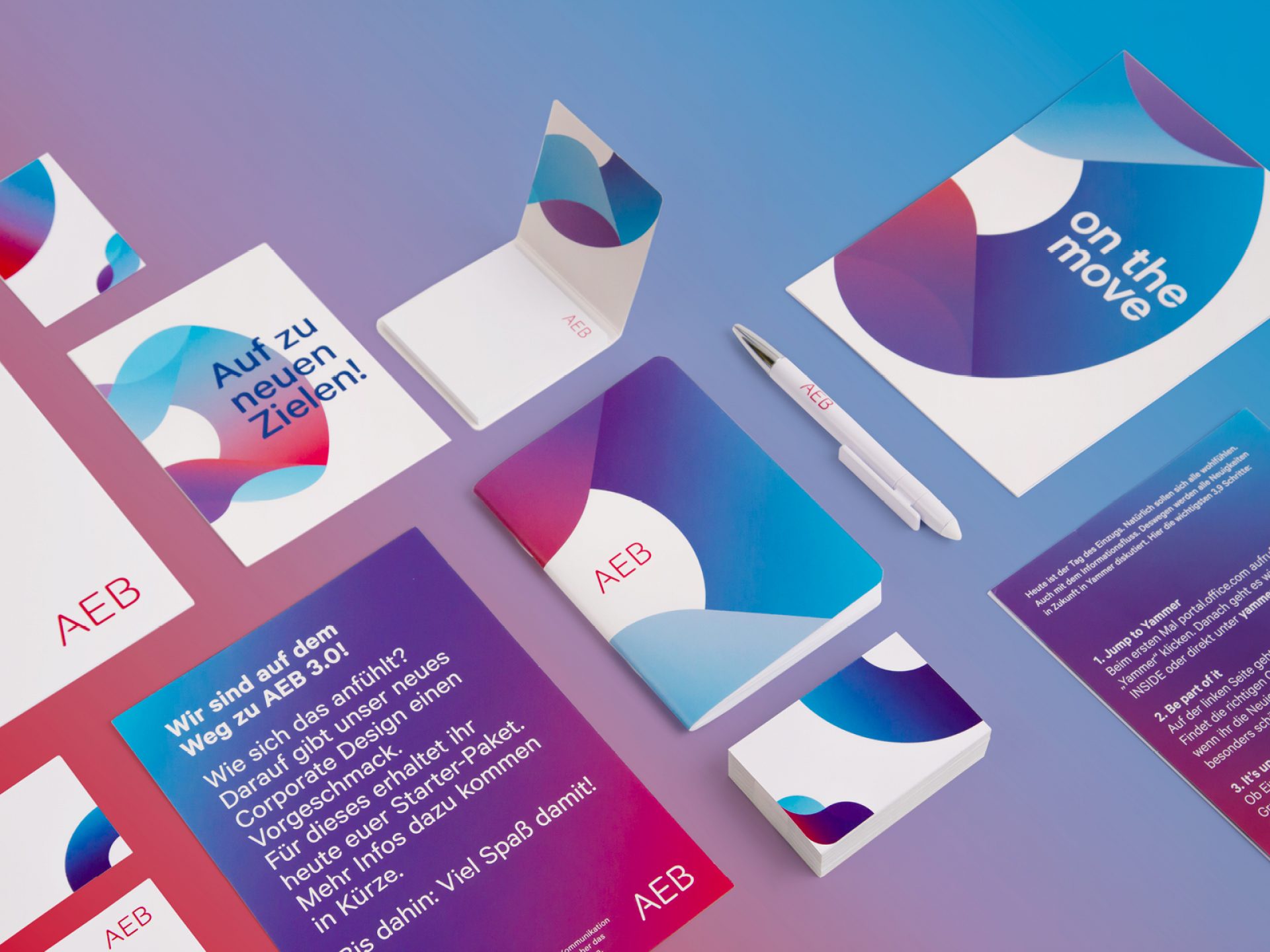
Internal brand launch
On the Move
A new brand also needs to be launched internally. In order to introduce the content and identity of the branding to AEG employees, we assisted with the internal launch of the corporate design. At an employee celebration organised by AEB, the new company headquarters in Stuttgart were simultaneously inaugurated and moved into.
Through a joint march from the old to the new building, the employees were literally introduced to the new brand step by step. They were accompanied by banners and posters and their own branded energy bars and water bottles for strength and refreshment.